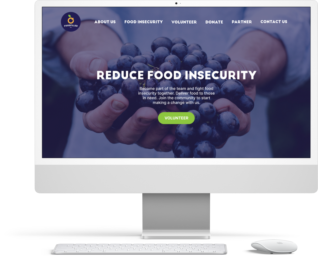
Foodfilled
I redesigned the landing page for an Australian non-profit organisation. The design was presented to the team as an inspiration for the update of their website. This project aims to transform the landing page to match with their brand identity, deliver clearer messages and increase conversion rate.
Role: Web Designer
Duration: 2 days
Client: Foodfilled
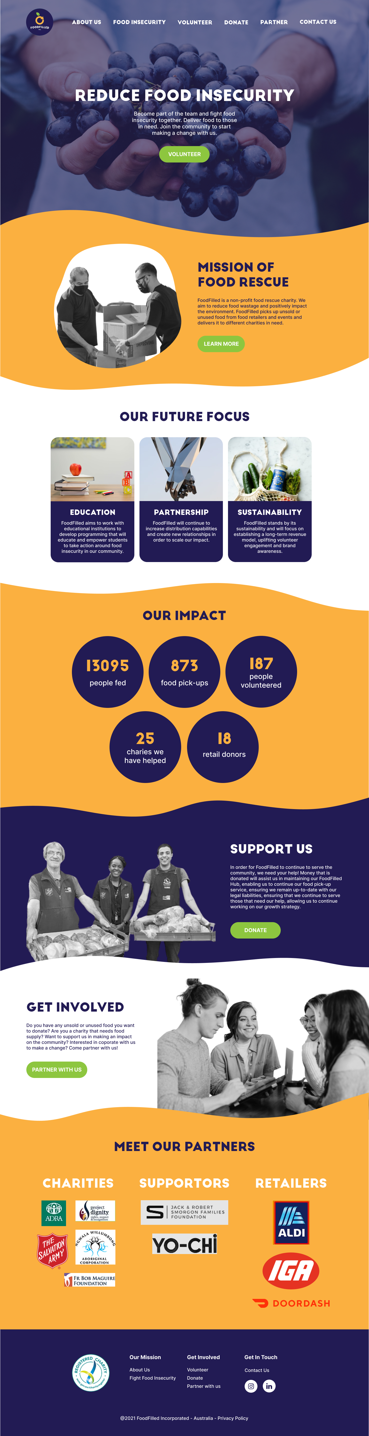
Challenge
What are we trying to solve?
How might we fresh up the aesthetic to in line with the branding, better communicate the purpose and functions of the site and increase conversion rate?